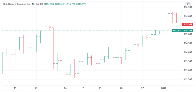
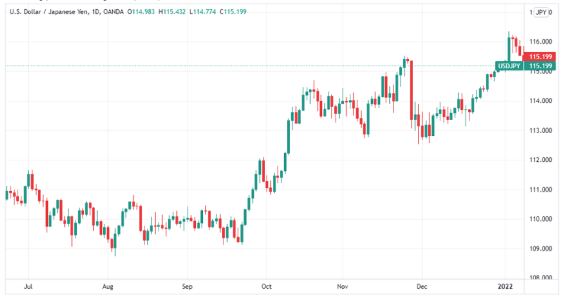
Ever stared at an OHLC chart and wondered why so many traders swear by it?
You’re not alone. Many beginners open a financial chart for the first time, see the bars, lines, and markers, and quickly close it in confusion. But here’s the truth, those simple lines and bars hold the key to understanding real price movements. Each bar on an OHLC chart shows how prices rose, fell, and settled within a particular time frame. Once you know how to read it, the chart shows the entire rhythm of the market in one glance.
Every financial instrument, whether it’s stocks, commodities , or currencies, has its own story told through open high low close data. The opening price acts like the starting price of the market’s mood, while the closing price reveals how traders felt by the end of the time period. The highest and lowest prices capture the battle between buyers and sellers during that same period. Learning to interpret these price movements helps traders understand when to enter or exit, making technical analysis less confusing and more strategic.
What is OHLC Charts
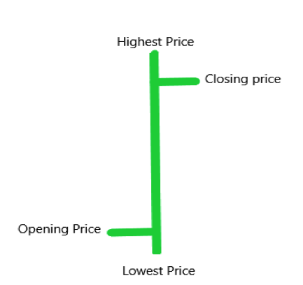
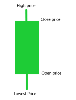
An OHLC chart is a simple yet detailed financial chart used in technical analysis to illustrate movements in the price of a financial instrument. Each bar on the chart shows what happened to prices during a specific period, like one day or one hour. The vertical line represents the highest and lowest prices, helping traders see how far the market moved.
The open price appears as a short horizontal line on the left, showing where the market began that period. The closing price is on the right, marking how the price ended. If the closing prices are higher than the opening prices, the bar is often green, showing that the prices rose. When the close price is lower, it usually turns red, signaling that prices fell.
Although OHLC charts display exactly the same data as candlestick charts, their design is cleaner and easier to study. Each bar acts as one unit of open high low close data, helping traders see price movements clearly. For trading strategies, this chart type builds strong foundations, allowing traders to focus on structure, balance, and timing within each time frame.
Price Movements in Trading
Every OHLC chart tells a story of how prices change and react to market pressure within a certain period. The vertical line on the chart clearly represents the distance between the high and low, showing how strong that movement was. The short horizontal line on the left shows the open, while the other side marks the close, making the open high low sequence easy to follow.
In most charts, these markers help traders understand if the market pushed higher or dropped lower within that session. When traders see longer high and low ranges, they know the market was active and uncertain. Shorter bars often suggest quiet periods, where traders wait for new signals to open or close positions.
OHLC charts help traders focus on data instead of noise, giving a balanced view of how prices move and react. Whether looking at stocks or currencies, these charts display open, high, low, and close patterns that reveal emotion and logic behind every move. Learning to watch these price movements helps traders act with clarity and patience rather than guesswork.
OHLC Bar Layout
Every OHLC chart is made up of bars that record how the price moved during a single period of time. Each bar represents four key points, the open, high, low, and close, giving traders a simple visual summary of price movements. These bars help traders read the market’s flow and spot potential turning points with confidence.
The layout of each bar follows a clear and structured design. A vertical line represents the entire range of prices, from the high at the top to the low at the bottom. On that same bar, a short mark on the left shows the open, and a short mark on the right shows the close. This small difference between the open and close values can reveal whether momentum was rising or fading during that period.
When the opening price is lower than the closing price, the bar is bullish, showing that buyers controlled that session. When the open is higher than the close, the bar is bearish, signaling that sellers took charge. These simple markers make it easier for traders to see patterns and emotions behind every move. Whether analyzing a daily bar chart or shorter setups, understanding the OHLC layout helps traders read the story hidden within each line of data.
Interpreting an OHLC chart
- When the price of an asset moves upward, the OHLC chart shows mostly bullish bars forming across the axis. Each bar starts with a lower open and ends with a higher close, showing that buyers are in control. This pattern helps traders understand when demand is pushing the stock price higher during that period.
- When the price of an asset is falling, the bars appear bearish, showing a clear downward story on the chart. The open is higher, and the close ends lower, meaning sellers have taken over the market. These signals help traders recognize when momentum shifts and prepare their next move.
- Sometimes, the lowest value might also be the opening or closing price, depending on market behavior. In other cases, the highest value might act as the open or close, showing quick reversals in price. These moments remind traders that even small bars can tell important stories about changing trends.
OHLC Charts vs Candlestick Charts
Many beginners often confuse OHLC charts with candlestick charts because both show the same data of market behavior. Each type reveals the open, high, low, and close values, helping traders understand price direction. The main difference lies in how they create their shapes and how traders read them visually. OHLC charts use clean lines to mark each value, while candlestick charts use solid bodies that highlight movements more clearly.
In both charts, the vertical line shows the high and low, while the horizontal marks display the open and close. The thicker shape of the candlestick gives a stronger visual cue to quickly read trends. Many traders prefer candlestick charts for quick analysis, while others rely on OHLC charts for cleaner technical analysis. Both offer the same story, only the style of presentation differs, letting traders choose which one fits their trading strategies best.
Technical Analysis with Open High Low Close
Every trader begins learning technical analysis by studying the open high low close data found on an OHLC chart. These four values give a clear picture of how the market behaves within a single period. The open shows where the battle between buyers and sellers began, while the close reveals who won at the end. Watching these shifts helps traders understand momentum, hesitation, and direction without needing extra tools.
The high and low act as emotional boundaries for traders, marking where fear or greed took control of price movements. When you read an OHLC chart, you are not just seeing numbers, you are seeing behavior and reaction. Over time, combining this understanding with support and resistance gives deeper insight into potential trading strategies. The goal of using open high low close analysis is not prediction but preparation, allowing traders to act with confidence and patience.
Also Read: Candlestick Patterns Cheat Sheet
Conclusion
Learning to read an OHLC chart is like understanding the language of the market. Each bar tells a story about how traders reacted to price changes within a given period. When you combine these stories, patterns begin to appear, showing you where strength and weakness might exist.
The key is patience and observation. By studying open high low close values carefully, you begin to see the rhythm behind every move. Over time, this awareness helps you make decisions based on logic, not emotion, turning confusion into confidence with every trade you take.
FAQs
1. What does each part of an OHLC chart mean?
Each bar shows four points, the open, high, low, and close. The open marks where trading started, the high and low show the range, and the close reveals where trading ended during that period.
2. Why do traders use OHLC charts instead of line charts?
OHLC charts give more detailed data than a simple line chart, showing both volatility and direction. They help traders analyze price movements more accurately and build stronger trading strategies.
3. Can beginners use OHLC charts for trading?
Yes, beginners can start with OHLC charts because they are simple to read once understood. With practice, traders learn to recognize market patterns and make better trading decisions based on real price behavior.