Learning how to read forex charts is the single most important skill any trader can develop, because every entry point, every exit point, and every risk decision starts with what the chart is saying.
Most beginners look at a forex price chart and see noise. A professional trader looks at the same chart and sees a story, covering where price has been, who controls the market right now, and where price is most likely to go next. The difference is not natural talent. It is knowing what to look for and where.
This guide covers the three main chart types, how to read candlestick charts in detail, and how chart analysis connects to real trading decisions.
|
ABOUT THIS GUIDE |
Written by Ezekiel Chew, founder of Asia Forex Mentor and a former institutional trader with over 20 years of experience. Ezekiel has taught thousands of traders across Singapore, the Philippines, Malaysia, and Indonesia how to read price action and forex charts without relying on lagging indicators. |
|
QUICK ANSWER |
Reading forex charts means understanding how price movements display across a time period and what those movements reveal about buying pressure, selling pressure, and market direction. There are three main chart types in forex: the line chart, the bar chart, and the candlestick chart. Most forex traders use candlestick charts because they show the most price data in the clearest visual representation, including the opening price, closing price, highest price, and lowest price for every single period. |
What This Guide Covers
- How a forex price chart is structured
- The three main chart types in forex
- How to read candlestick charts
- Green and red candlesticks explained
- What chart patterns tell you
- Using technical analysis and technical indicators
- How to choose the right chart type
- Frequently asked questions
How a Forex Price Chart Is Structured
Before exploring chart types, it helps to understand what every forex chart is actually displaying. A price chart is a visual representation of how a currency pair's price has moved over a chosen time frame. Every chart has two axes that work together to show this data.
The vertical axis, also called the y axis, shows the price level. Higher positions on the chart represent higher prices, while lower positions represent lower prices. The horizontal axis, also called the x axis, shows time, moving left to right from older price data to the most recent activity.
Each unit on the chart, whether a line point, a bar, or a candle, represents one time period of trading activity. On a one-hour chart, each unit covers one hour of price movement. On a daily chart, each unit covers a full trading day. The selected time frame determines how much detail is visible, however it does not change the underlying price data being shown.
|
KEY POINT |
Changing the time frame does not change the price. It changes how much detail is visible. A five-minute chart shows every small price movement in granular detail, while a weekly chart smooths all of that into one bar per week. Both display the same market and the same price action. |
The Three Main Chart Types in Forex
Forex charts come in three main forms. Each one displays the same price data differently, and knowing which to use in which situation is the starting point of all chart analysis.
The Line Chart
A line chart plots only the closing price for each period and connects those closing prices with a single continuous line. The result is a clean visual representation of how price has trended over time, making it easy to identify the general direction of a currency pair at a glance.
However, the line chart has a significant limitation. It hides the opening price, highest price, and lowest price reached during each period, meaning a large portion of useful price data is invisible. As a result, many forex traders use the line chart only for a quick overview before switching to a more detailed chart type for actual trading decisions.
The Bar Chart
A bar chart gives traders far more price data than a line chart. Each period is represented by a vertical line, or bar, that shows four pieces of information simultaneously. The top of the vertical line marks the highest price reached. The bottom marks the lowest price. A small horizontal tick on the left of the bar indicates the opening price, while a tick on the right marks the closing price.
Advanced traders who want full price data without the visual weight of candlestick charts sometimes prefer bar charts. Nevertheless, for most forex traders, candlestick charts communicate the same information in a more intuitive format.
Candlestick Charts and Why Most Traders Use Them
Candlestick charts show the same four data points as a bar chart, covering the opening and closing prices along with the highest price and lowest price, but in a format that is much easier to read instantly. According to Investopedia, candlestick charting originated in Japan in the 18th century and remains the most widely used charting method in financial markets today.
Each candle has two parts. The body is the thick rectangular section representing the range between the opening and closing prices for that period. The wicks, also called shadows, are the thin lines extending above and below the body, showing the highest price and lowest point reached beyond where the candle opened and closed.
| Candle part | What it shows | What it tells traders |
| Body | Range between opening and closing prices | Whether buyers or sellers were in control for the period |
| Upper wick | Highest price reached during the period | How far buyers pushed price before sellers stepped in |
| Lower wick | Lowest price reached during the period | How far sellers pushed price before buyers stepped in |
Green and Red Candlesticks Explained
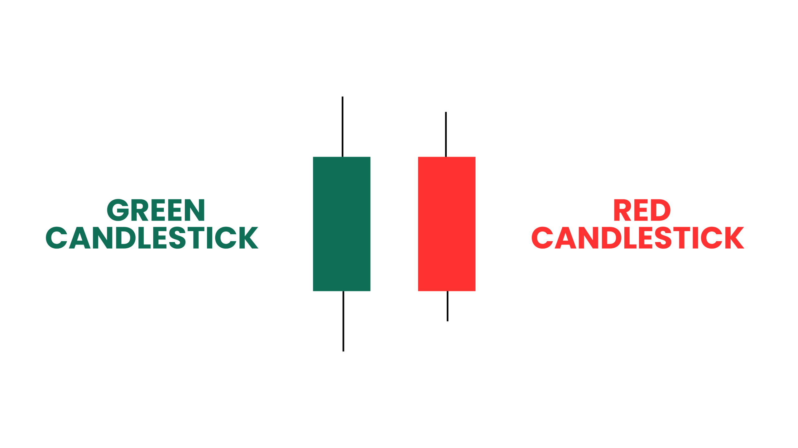
The colour of each candlestick immediately tells traders whether buyers or sellers controlled that period. This is one of the most useful features of candlestick charts and one reason so many traders prefer them over bar charts or line charts.
A green candlestick, sometimes shown as a white candlestick on older trading platforms, means the closing price was higher than the opening price. Buyers were in control and price moved up during that period, signalling buying pressure. Conversely, a red candlestick means the closing price was lower than the opening price. Sellers were in control and price moved down, signalling selling pressure.
When multiple green candlesticks form in sequence, they signal sustained buying pressure and an uptrend. When multiple red candlesticks form in sequence, they signal sustained selling pressure and a downtrend. Reading these sequences is the beginning of understanding price action, which is how the market is actually behaving rather than what an indicator is guessing it might do. For a deeper look at price action in the forex market, see the AFM price action trading guide [internal link].
Reading Chart Patterns and Price Data
Once a trader can read individual candlestick types, the next step is identifying chart patterns. These are repeated formations that appear across forex charts and provide clues about future movements based on how price has behaved in similar situations before.
Chart patterns form because market behaviour is consistent. The same situations, such as price reaching a key level, traders taking profits, or large orders being filled, tend to produce similar shapes on the chart. Common examples include support and resistance levels where price repeatedly reverses, trend lines connecting higher lows in an uptrend or lower highs in a downtrend, and consolidation zones where price moves sideways before breaking in one direction.
| AFM PERSPECTIVE | One pattern that AFM students frequently misread early on is a support level that forms during low-liquidity periods, such as the Asian session, and then breaks aggressively during the London open. The pattern looks valid on the chart, however the context surrounding it tells a completely different story. Chart patterns carry real weight only when they form at key institutional levels during high-participation sessions. Without that context, the same pattern can predict the opposite outcome. |
Using Technical Analysis and Technical Indicators
Technical analysis is the practice of using historical price data on forex charts to identify trends, patterns, and potential entry and exit points. It is the framework that connects chart reading to actual trading decisions, and it forms the basis of how most forex traders approach the market.
Technical indicators are mathematical calculations applied on top of price charts to help interpret price movements. Common examples include moving averages, which smooth out price data to show overall trend direction, and the RSI, which measures whether a currency pair has moved too far in one direction too quickly.
Many technical traders use indicators as a secondary layer on top of their chart analysis rather than as the primary signal. Using technical indicators alone, without first understanding the underlying price action, is one of the most common mistakes beginners make. An indicator is always based on past price, meaning it tells traders what has already happened. The chart, by contrast, shows what is happening right now.
For live charting practice across all major currency pairs, TradingView provides free access to real-time forex charts with a full suite of technical analysis tools.
How to Choose the Right Forex Chart Type
The best chart type depends on what the trader needs from the data at that moment. For active chart analysis and trading decisions, candlestick charts are the clear choice for most forex traders. They display the most price data in the most readable format and are supported by every major trading platform available today.
Mountain charts, a variation of the line chart with the area below the line shaded in, are useful for presentations and quick visual checks on long-term trend direction. However, they are not practical for identifying specific entry and exit points or reading individual candlestick types in any detail.
The choice of time frame ultimately comes down to personal preference and trading style. Day traders typically work from five-minute to one-hour charts. Swing traders primarily use four-hour and daily charts. Position traders work from daily and weekly charts. Regardless of the time frame selected, the rules of chart reading remain the same.
Also Read
Conclusion
Forex charts are the primary tool every forex trader uses to understand market conditions, identify where price is likely to move next, and decide when and where to trade. The three main chart types, the line chart, the bar chart, and the candlestick chart, each display price data differently. However, candlestick charts are the standard because they show opening and closing prices, the highest price, and the lowest price for every period, making buying pressure and selling pressure immediately visible.
Chart analysis is a skill that develops through consistent practice. Start by learning to read individual candles, then progress to identifying chart patterns and trends across multiple time frames. Add technical indicators only once the raw price action on the chart makes sense without them. That sequence builds the chart reading ability that produces consistent, confident trading decisions over time.
Frequently Asked Questions
How do you read forex charts for beginners
Start with the basics of chart structure. The vertical axis shows price and the horizontal axis shows time. Learn the three main chart types, focusing on candlestick charts first since they show the most useful price data. Understand what green and red candlesticks mean, then practice identifying trends across different time frames. Everything else in chart analysis builds from that foundation.
What is the best chart type for forex trading
Most forex traders use candlestick charts because they display four key data points for every period, including the opening price, closing price, highest price, and lowest price, in a format that is easy to read instantly. Candlestick charts also reveal buying pressure and selling pressure through candle colour, body size, and wick length, making them the most informative chart type for technical analysis and price action trading.
What do the wicks on a candlestick mean
The wicks, also called shadows, are the thin lines above and below the body of each candlestick. The upper wick shows the highest price reached during the period. The lower wick shows the lowest price. Long wicks indicate that price moved significantly in one direction but was pushed back before the period closed, signalling that buyers or sellers stepped in strongly at that level.
What is the difference between a line chart and a candlestick chart
A line chart shows only the closing price for each period and connects those prices with a single line. It is simple and clean but hides the opening price, highest price, and lowest price, meaning a significant amount of useful price data is missing. A candlestick chart shows all four data points for every period. For active trading and chart analysis, candlestick charts provide far more information and are used by the vast majority of forex traders.
What time frame should I use when reading forex charts
The right time frame depends on the trading style. Day traders typically use five-minute to one-hour charts for entry and exit points. Swing traders use four-hour and daily charts to identify setups that play out over several days. Most professional traders use a top-down approach, starting on higher time frames to understand the overall trend, then moving to lower time frames to find precise entry points.
What are chart patterns in forex trading
Chart patterns are repeated formations on forex charts that traders use to anticipate future price movements. They form because market behaviour is consistent across similar situations. Common chart patterns include support and resistance levels, trend lines, head and shoulders formations, and consolidation zones. Chart patterns are most reliable when they form at key price levels and are confirmed by the surrounding price action.
Do I need technical indicators to read forex charts
No. Many professional traders read forex charts using price action alone, without any technical indicators. Indicators are mathematical calculations based on past price data, which means they always lag behind what the market is currently doing. The raw candlestick chart reflects the market in real time. Technical indicators can serve as a useful secondary confirmation tool, however they should not replace a solid understanding of the underlying price data.
What is price action in forex trading
Price action is the study of how price moves on a chart without the use of lagging indicators. A price action trader reads the sequence of candlesticks, the size of candle bodies and wicks, the location of price relative to key levels, and the momentum of price movements to make trading decisions. It is the most direct form of chart analysis because it is based entirely on what the market is doing right now.